West Coast Conference: Brand Manifesto and Packaging
OVERVIEW:
Credits:
CREATIVE DIRECTOR: DAVID RICKLES
ART DIRECTION: DAVID RICKLES
ANIMATION: DAVID RICKLES, NATALIE VITALIE
SCRIPT: David Rickles
PRODUCER: Chris Hunt
WCC Commissioner: Gloria Nevarez
In 2019, the West Coast Conference (WCC), known for its excellence in college basketball and Olympic sports, set out to redefine its narrative. The brand needed to capture and convey key pillars: Momentum, Excellence, Purpose, Grit, and Confidence. It was essential that the brand exude an authentically "West Coast" vibe—rich in color, mood, swagger, and energy—while repositioning the WCC not merely as a strong competitor in certain sports, but as a dominant force across all collegiate athletics.
I was invited to transform these verbal concepts into a compelling visual identity for the WCC. This effort resulted in two major components: a brand manifesto that clearly articulates the new brand position, and a cohesive, branded web-broadcast package designed for their live game streams.
Brand Manifesto
Capturing this new brand positioning required a fresh, high-energy approach that respected the rich history of the conference while also forging a cinematic and youthful connection with the new generation of fans.
To bring this vision to life, we combined fast-paced, energetic graphics and text treatments with quick cuts of dynamic student-athlete performances.
The driving narrative was carefully crafted to articulate the brand’s core values, framing them in a way that only the WCC could authentically deliver.
Live Broadcast Packaging
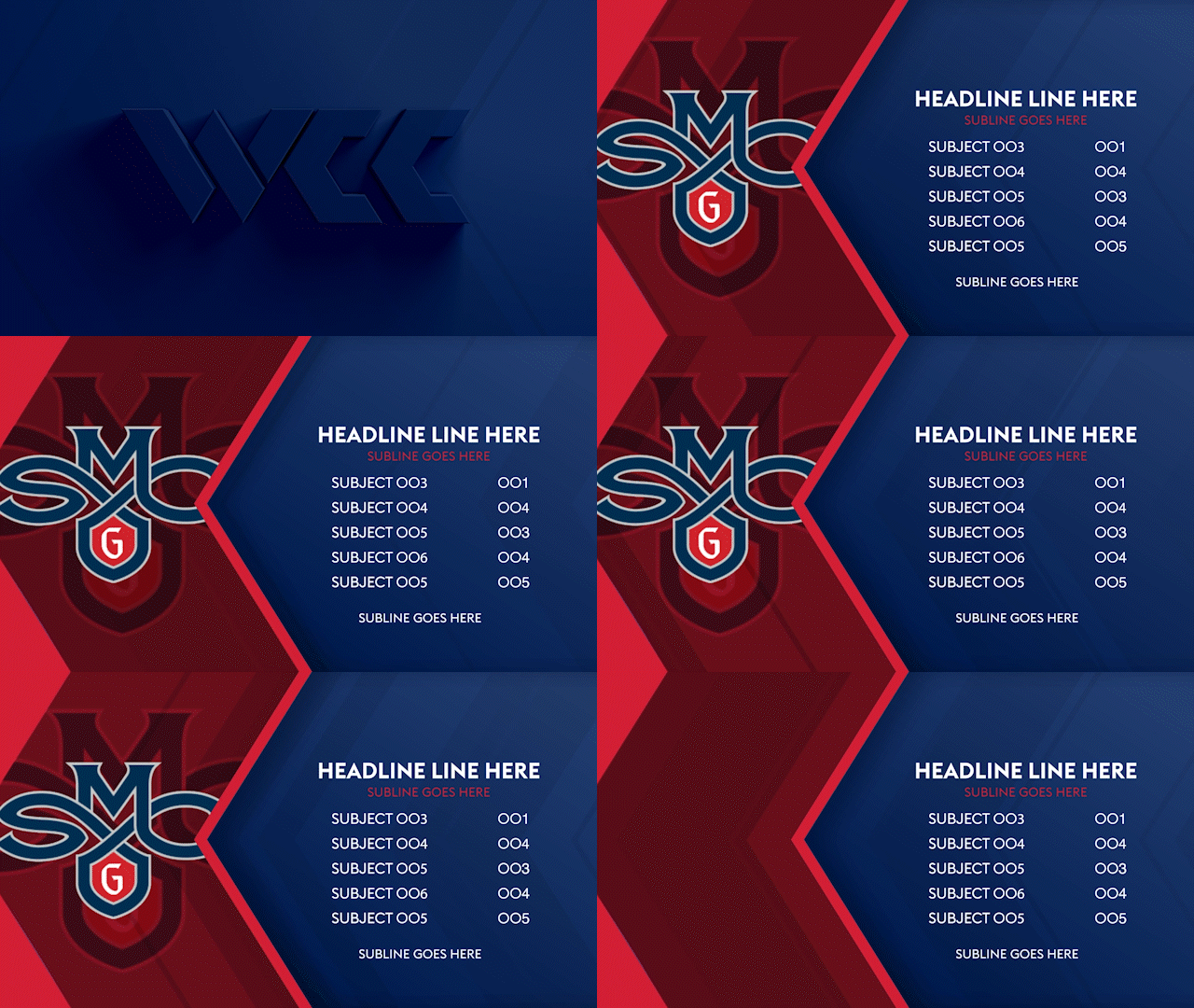
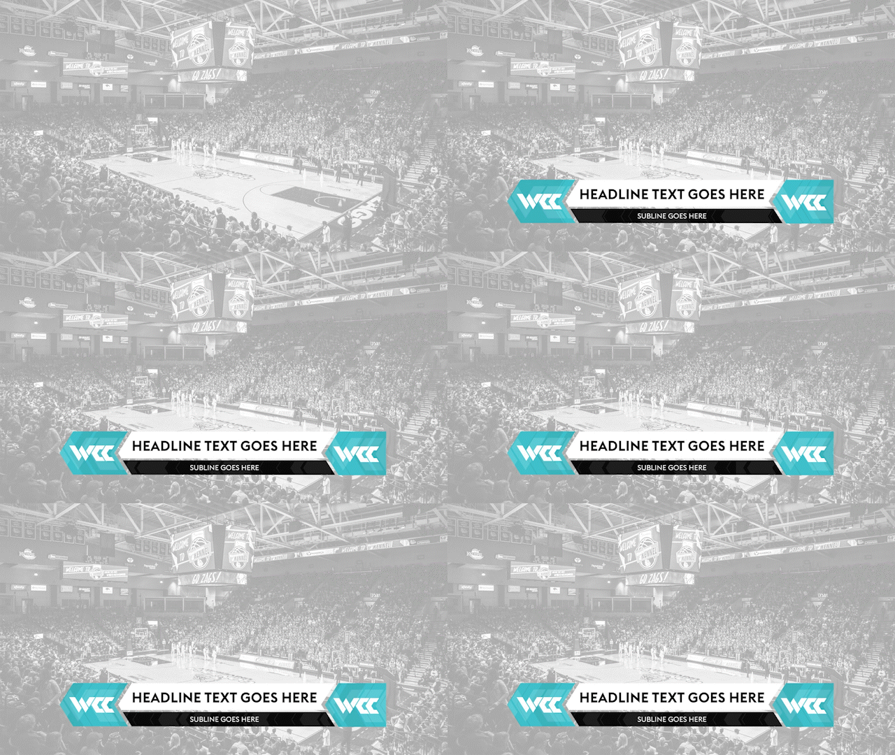
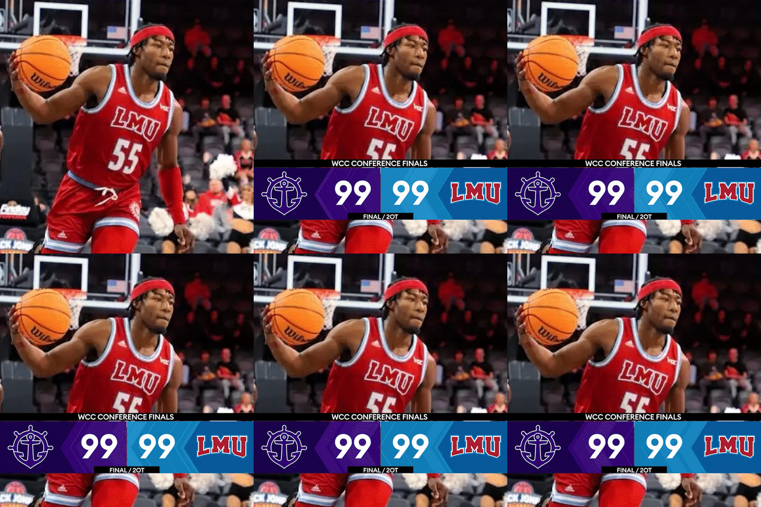
The live broadcast packaging had to establish the WCC as a credible live-sports broadcasting entity, while also being versatile enough for nearly complete post-production through templated systems. Embracing the complexity of this task, I dove in, starting with the design of each element—from intro animations to insert design systems.
The Left Coast
Being called the “West Coast Conference,” comes with some obvious parallels. And knowing that capturing the “West Coast Vibe” is key to staying true to the new brand, finding a way to embrace this became paramount. As a longtime resident in a west-coast city, we often will make light-hearted comments about the west coast being the “left” coast, and this became a foundational idea for the broadcast packaging.
The insert systems were thoughtfully designed by drawing inspiration from the angles of the new WCC logo's "W." We created multiple layout and shape options that consistently leaned "left," symbolizing a deliberate, westward direction. The motion theory was developed around two geographically inspired principles: a flow toward the west and a cascading movement reminiscent of ocean waves.

Animation Elements
Webcasts have a much smaller demand for animated graphics than traditional broadcasts, but the demand for their quality is no less. Using the same principles established creating the insert system, animated elements put focus on the WCC logo, while still harkening back to the left-coast foundation.
Social Media Assets
In today's increasingly social media-driven world, it was crucial for the brand to showcase itself flexibly and effectively across various platforms. Starting with a small set of initial assets, we tackled the challenge of reformatting content in a brand-consistent manner while adapting to the more attention-grabbing demands of these mediums.


